|
Threepenny Opera
(Scenic Design)
Context/Pretext:
This was the first production that I had designed for The University of Cincinnati's College-Conservatory of Music. While the straight dramas that I had designed for them were of limited scale, the program usually produces musicals and opera on a grand scale.
This was a milestone production for the conservatory as it marked the retirement of director Worth Gardner as well as of conductor Oscar Cassarin (who had worked on the original production of Pal Joey).
The quality of production at CCM is quite quite high. One of the freshmen performers had already appeared on Broadway for 4 years in A Chorus Line. About 80% of the rest of the cast was performing on Broadway within 5 years of graduation. It is an intense program with intense expectations.
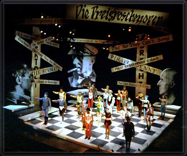
This is one of the few times I have worked with a director that imposed many specific mandates up front. The use of the checkerboard motif was mandated as was the use of the giant heads of Brecht. The use of a raked stage as well was a mandate up front.
Such specific mandates always make me feel uneasy but Worth Gardner is a
great director and I was happy to trust in his vision while building upon it.
Description of the Settings:font>
As stated above, the set consisted of a prime acting space consisting of a square platform on a diagonal axis and raked. The downstage sides had an additional rectangular platform attached at a lower angle and hanging over the pit.
At the vertices there were a series of steps leading up and over to exit the stage.
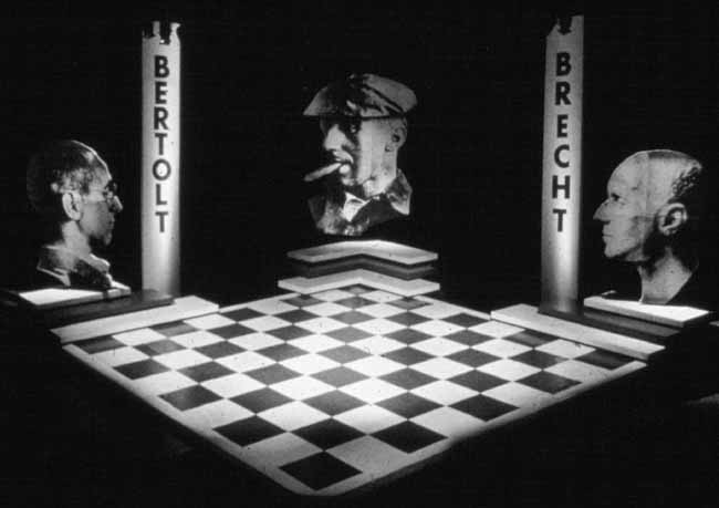
At the top of these step landings were a series of three large photographs of Brecht. These were actual photographs up to 13 feet high which I produced in a dressing room using Kodak mural paper and a slide projector as an enlarger.
(Alas today this would be so easy to accomplish using computer
imaging systems). These head elements were designed to rotate like a revolving door as requested by the director. The design and construction worked flawlessly but the director then opted to fix the heads in one position.
In this production the title signs became a prime element, but I used these in a kinetic, developmental way. Whether staging uses signs or projections, the tradition is to present the title and then remove it. In our case the titles cumulated, further cluttering the stage picture until a wall of signs was created by the end of the show.
In addition to the signage drawn from the script, the German title of the production was displayed above and the name Bertold Brecht framed the head photographs.
The furniture and props were of two varieties. First we had highly sculptural, highly sexual furniture drawn from the style used in the film, A Clockwork Orange. These furnishings included a "penis couch" as well as a series of what we called "boob chairs". The latter was fun to design. On the raked stage, I had to design the spherical seats in a way that prevented them from rolling into the pit. The accentuated nipples were designed using Nerf technology so that actors could sit on them without pain to themselves (although audience members were somewhat pained at having to watch. It was a fun reaction).
The second category of furnishing and props paralleled the photo Brecht heads. The wedding presents and associated props were too, photographs.
Conceptual Foundations:
The concept for this production grew out of a parallel that the director wanted to draw with the world depicted in the film (and book) of A Clockwork Orange. He was searching for a more modern analog to explore of the a-moral characters produced by their society. I thought the parallel was an effective one and I was willing to fully buy in.
I was concerned at first with the director's specification of the checkerboard but I was amazed at how disciplined Worth's blocking was. He had told me that he intended to structure the blocking and choreography to the geometries of the board but I was skeptical about success of such a venture. I was frankly amazed at the results. The cold exactness of this choreography is very apparent, I feel, even in the isolated examples I provide of production photos.
Worth's instincts also appeared to have worked in regards to the choice of the large Brecht heads and the choice of including his name within the production setting. I never fully justified these in my mind dramaturgically except in homage to the man himself, but the device seemed to work nevertheless on a dramatic level even if I never knew fully why.
Of more interest to me was the methodology used in the signage. I was excited to have discovered the mechanism by which the signs would linger and layer into a cacophony of ideas and forms. This reinforces the concept of the cumulative interaction of social influences in the process of "socialization".
To me, the score comes most alive in its original German with the gross inflection. This is why I opted to add the title
in German. I wanted audiences to always see the show within the Germanic context.
As in most of my work, the setting was light reactive. The student lighting designer used lighting to reinforce the geometries of emotion and space. He also used multiple repertoires of color. At times the stage picture would be devoid of color. The lighting would be contrasting and directional. At other times color would burst forth reflecting a particular garish moment in the action.
When a director offers me a specific laundry list of instructions, besides trying to find a conceptual basis, I often try to use the list as a springboard for pushing the envelope. Such an instance is evident in the use of the 2-dimensional photographic props for the wedding scene. The absolute artifice of the social context was very much accentuated with this choice. The point is further driven home when Mac, in prison makes his request for peas to eat and then has to eat them with a knife. In our iteration he is brought not peas, but a PHOTOGRAPH of peas, which he must then eat with a PHOTOGRAPH of the knife.
I took a big risk with creating a "penis couch". Cincinnati is not the safest place for such sexual imagery, and in fact I took a lot of heat from the theatre's producer. While this was another element mandated by the director, I felt it justified not only by the content of the play, but also within the context of our
Clockwork Orange parallel. Worth waited for just the right moment to reveal the piece. The women enter carrying it on their shoulders (to the gasps of the audience members of Cincinnati). Their entry line, right from the text: "Men! Who needs them?!" What a wonderful moment of cynical irony we provided. In the blocking, Worth then had the gals use the sofa in some wonderfully humorous, clever ways.
p>
|